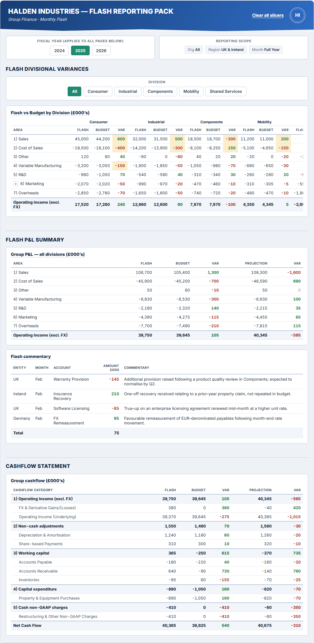
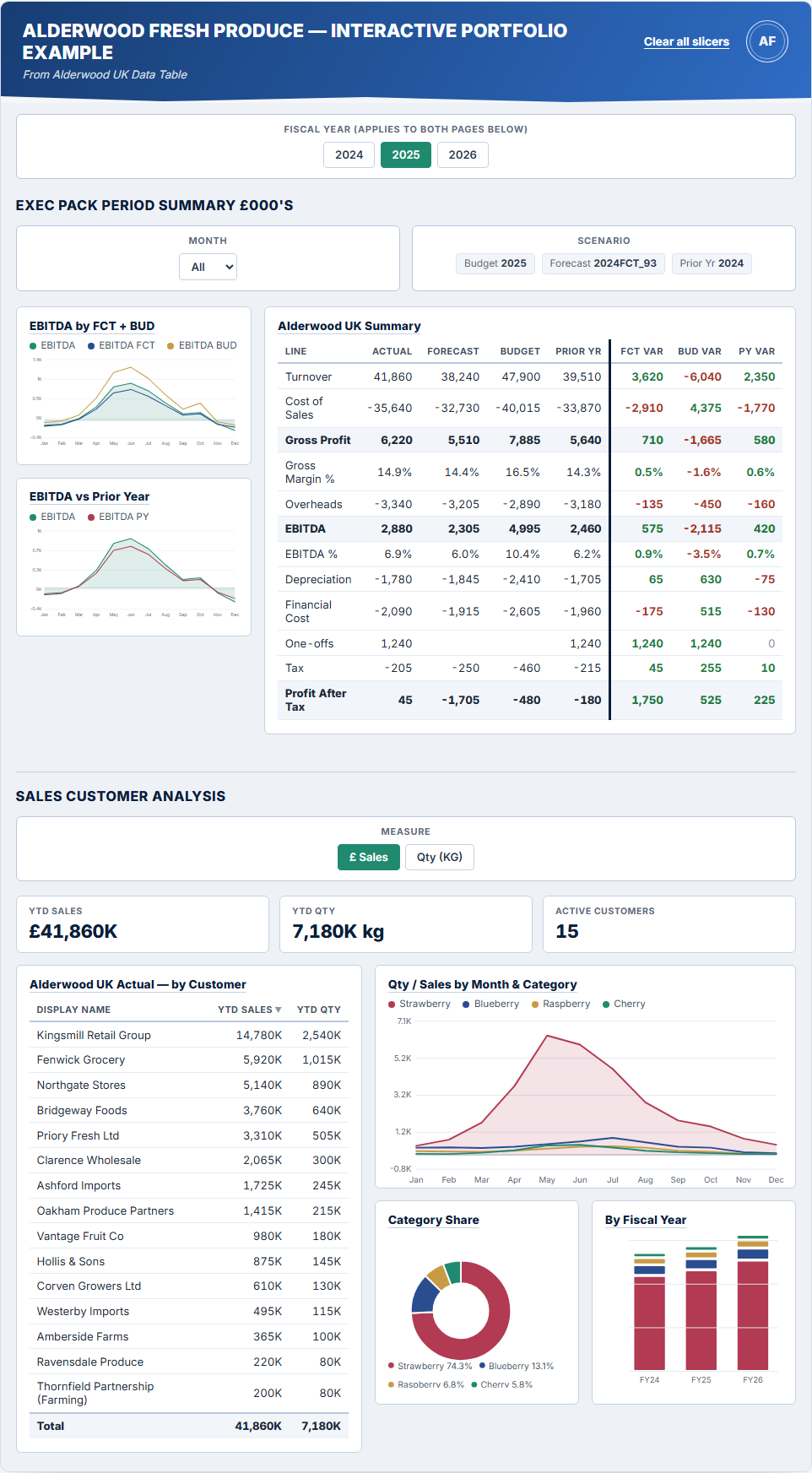
Interactive Exec Dashboard & Sales Analysis
Fictional company, illustrative data
Challenge
A static screenshot can show what a Power BI dashboard looks like, but not what it feels like to use — the slicers, drill-downs, sorting and cross-filtering that make a report genuinely useful day to day.
Approach
Built a two-page exec pack — a P&L/EBITDA summary and a customer sales analysis — as a live, interactive preview embedded directly on this page. Fiscal year and measure slicers, sortable tables, hover tooltips and conditional formatting all behave the way they would in a real Power BI report. The company, customers and figures below are entirely fictional, built for demonstration only.
Outcome
A hands-on example you can actually click through, rather than a static picture — giving a much closer feel for the finished product than a screenshot ever could.